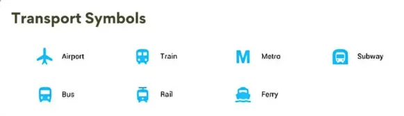
Google Maps makes it really hard to tell in new cities what modes of transport they're recommending. The default "train" and "bus" icons are quite difficult to tell apart at a glance, but also...
April 10, 2026 - 16:24 UTC
1
0
2