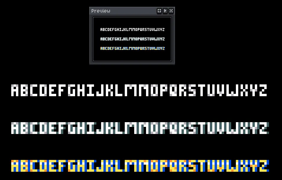
Look good! The 'Q' there is well done, it inspired me to refine the Q in my personal font. What do you think of it in general?
1
0
0
I love it! I generally stay away from single pixels, they are usually noise or, in the case of antialiasing, blur
1
0
2
Yeah, I only use it for very visible clean images, like on sprite rips or production material. It would definitely have to be thicker for real retro style use.
1
0
2